
Manage your listing
Follow a step-by-step guide with online chat support to create or manage your listing.
Community


Let’s talk

Dana Stanley
Greenbook’s Chief Revenue Officer
Categories
Insights Industry News
September 1, 2022
The Fundamentals of Layout Design for Insights
Data visualization is easy with basic design layout design principles.
by Emma Galvin
0
What is Layout Design for Insight Communication?
Layout and composition are the foundations of good insight communication. Regardless of your medium, understanding the effect layout has on your audience’s visual perception is crucial for Market Researchers. By developing your composition skills, your layout can be one of the most effective ways of storytelling. But if used badly, your message could become lost within your layout and you risk communicating the wrong insights. Additionally, having a good eye for composition can have a financial effect on your business as well, behavioral economics suggests that people pay more for better presentation. For example, people are willing to pay more for food served on a plate than on a napkin. Better layout equals a better presentation, which then equals your company being able to charge more money for their services.
For more layout design insights, check out our top tips on how to create the best infographics.
The psychology of layout design
“The whole is greater than the sum of its parts.” – Aristotle
This is the key concept of Gestalt psychology; a 1920s design movement that underpins the effect layout has on your visual perception. The theory is that the human brain makes sense of the world. It does so by grouping several elements to form one whole, instead of several separate objects.
From this, five simple principles were established to aid visual understanding:
-
Similarity
We group similar objects to make sense of the world around us. For example, this could be grouping things of similar color, shape, scale, typeface, or even types of information on a page.
-
Continuation
The eye visually identifies information by following things. For example, we read text best in a line.
-
Closure
Complete shapes or layouts are the simplest things to improve visual perceptions.
-
Proximity
The composition of lots of objects manipulates the message of the whole image. If you have text boxes that all relate to each other or are the opposites of each other, the placement is crucial depending on what message you want to give.
-
Order
There must be an order and hierarchy to your layout. Otherwise, there will be visual anarchy. Therefore, we group types of text into headlines, subheads, and body text. Also, if there are too many groups the audience will get visually lost and won’t be able to decode the meaning of the document.

Image Source: http://sibraco.com/rules-of-design-gestalt-principals/
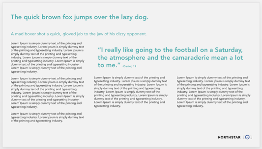
Based on these five key principles, we have our own five top tips for great layout design and how to ensure you communicate the right things to your clients.
Use a grid
Before thinking about your layout or aesthetic, a grid is a very first thing you should create. A grid is a set of guidelines you give your document. It includes things like margins and gutters, and most importantly it is to help you guide your layout, it will never be seen by your audience.
Firstly, it makes sure your margins are consistent throughout the whole document, it helps keep your layouts clean, tidy, and legible, and will guide you as you progress creatively with your data visualizations and reports. As the designer, it will help you make sense of your layout and give it purpose by helping you work out what text boxes, images, or objects should be aligned with each other.

Depending on the nature of your document, i.e. a visualizing qualitative data, a research presentation, visualizing quantitative data, content-heavy report, or interactive PDF, your grid can be anything from a three-column vertical grid to a five-column by five-row grid. The key is to align things to each other, so they don’t appear as if they are floating on the page.
Hierarchy
Hierarchy is essential in any document, regardless of whether it’s client-facing or stimulus for a focus group, we know this because behavioral economics suggests that the first thing we see about a brand or a product informs our overall opinion of it. Since we are nothing if not research storytellers, hierarchy is crucial because you need to make sure the first thing your audience sees is actually the most important.
When designing each page, you should know before you start what is the most crucial element of that page and what you want your client to remember from it. You should then apply the most appropriate ‘level’ (e.g. title, intro text, quote, etc.) to that element and build your layout around that. This allows the most crucial elements of your content to be your communication focus point.
Use boxes
The key to great layouts is to box up all the individual elements to form one whole and keep the amount of space between each one consistent. Again, the eye visually perceives things much better when everything is grouped. Furthermore, it will make your layouts much cleaner and easier on the eye, and you will avoid ‘floating’ elements. This does not mean literally put everything into colored boxes, just group elements where you can.

Utilise white space
Give your layout space to breathe. If you overcomplicate your layout or add in any unnecessary elements that don’t aid your story, then you will overwhelm your audience and they won’t be able to visually interpret the page. Ultimately this could end in your insights not being communicated.

Scale and balance
Earlier we mentioned the importance of hierarchy. A good way to direct your audience’s attention to particular areas of your data visualizations and make your layouts more diverse is to sensibly use scale. Making statements, quotes or key points bigger or bolder is a great way to pull out the key messages. Having said this, you don’t want to make elements too big so that they are screaming at your audience, or make it look as if you have run out of things to put on that page so you have just made something bigger.

Making sure your layout is balanced makes the aesthetic easier on your audience’s eye, and makes sure that one side isn’t too heavy.
Disclaimer
The views, opinions, data, and methodologies expressed above are those of the contributor(s) and do not necessarily reflect or represent the official policies, positions, or beliefs of Greenbook.
Comments
Comments are moderated to ensure respect towards the author and to prevent spam or self-promotion. Your comment may be edited, rejected, or approved based on these criteria. By commenting, you accept these terms and take responsibility for your contributions.
More from Emma Galvin
Monthly Dose of Design
Innovation Management: Barriers to Innovation (Part Five)
The five main barriers to innovation.
Emma Galvin
Creative Designer at Northstar Research
Monthly Dose of Design
Innovation Management: Disruptive Innovation (Part Four)
Disruptive innovation: What it is and why it’s important to MR.
Emma Galvin
Creative Designer at Northstar Research
Monthly Dose of Design
Innovation Management: Breakthrough/Radical Innovation (Part Three)
Diving into breakthrough/radical innovation and how it applies to MR.
Emma Galvin
Creative Designer at Northstar Research
Monthly Dose of Design
Innovation Management: Sustaining Innovation (Part Two)
Digging deeper into “sustaining innovation” and its relevancy to MR.
Emma Galvin
Creative Designer at Northstar Research
ARTICLES
Top in Quantitative Research
Research Methodologies
Moving Away from a Narcissistic Market Research Model
Why are we still measuring brand loyalty? It isn’t something that naturally comes up with consumers, who rarely think about brand first, if at all. Ma...
Devora Rogers
Chief Strategy Officer at Alter Agents
Qualitative Research
The Stepping Stones of Innovation: Navigating Failure and Empathy with Carol Fitzgerald
Natalie Pusch
Senior Content Producer at Greenbook
Sign Up for
Updates
Get content that matters, written by top insights industry experts, delivered right to your inbox.
67k+ subscribers