
Manage your listing
Follow a step-by-step guide with online chat support to create or manage your listing.
Community


Let’s talk

Dana Stanley
Greenbook’s Chief Revenue Officer
Categories
Insights Industry News
August 27, 2018
Using “Small Multiples” Visualizations for Big Success
Visualizing data can be made easier by utilizing small charts for comparison and analysis
by Tim Bock
0
What’s better than one big chart? Lots of small charts! The most common name for a series of small charts in a table layout is “small multiples”. They are also known as trellis, lattice, grid, and panel charts. In this post I show some good examples and some general principles, and provide links to some free software which can be used to create small multiples.
Small multiples make comparison easy and fix overplotting
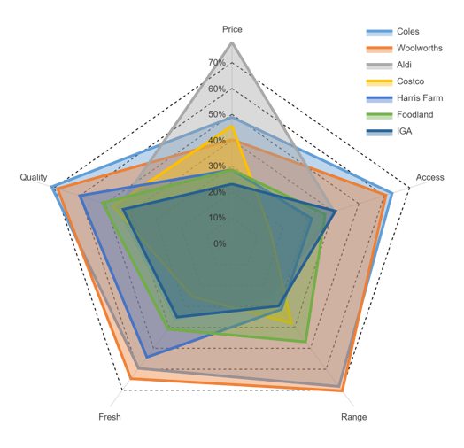
Look at the radar chart above. What does it tell you? If you spend enough time looking at it you will work out the basic patterns, but it is difficult.

What about this small multiples version? Plotting each brand separately makes it much easier to compare and contrast the brands. The ability to add brand labels to each chart, and to show the average (in grey) improves this visualization even further. It is difficult to escape the conclusion that this is a vastly superior chart to the traditional radar chart.
With some chart types the benefits are even greater. If you want to compare and contrast brands using funnel charts, small multiples are the only way to go.

Similarly, when comparing geographic data, small multiples are almost always the best option.

Two secrets to an effective small multiple
Both of my favorite data visualizations of all time are small multiples. The first one, which I’ve shown below, is more than 200 years old. This chart does an amazing job of summarizing the commercial history of the world. It allows us to easily just how dark the Dark Ages were, with only Constantinople and Denmark thriving (apparently knowledge of Asia and the Americas had yet to reach the designer of this chart). It also clearly shows that both the French and American revolutions crippled these respective economies. The less educated, such as myself, can even learn some history from the chart! For example, I had never heard of the Hanseatic League prior to seeing this data visualization (“Hans Towns”), but since finding this chart have not only learned of their existence but even visited a few.

In part, the visualization above is awesome due to its data and the decision to use a small multiple. However, it does two other things really well:
- The data has been ordered, with the more recent civilizations appearing higher, which makes it really easy to see patterns.
- The decision to use a simple chart type (in this case, area charts). Our brains are wired to make it easy for us to interpret the shape of area charts. We have evolved to instinctively understand the lie of the land – hills, mountains, valleys – and area charts tap into this instinct.
Ordering and chart type
The importance of the ordering and choice of chart type can be better appreciated by looking at this less successful example of small multiples, shown below. This example is also pretty and also very old. However, the choice of chart type (treemaps) and the ordering are comparatively poor.

The decision to show a small multiple of treemaps is problematic. The patterns evident in this visualization are much harder to compare than in any of the other examples in this post. The most telling evidence of this is that the resolution of this visualization is so low that we can’t even read the category labels. This probably means whoever originally posted it did so without even reading it! You can find a nice high-resolution version at the Library of Congress.
The data has been ordered alphabetically. If we spend a lot of time looking at it we can see that the southern states are similar. A better visualization would have ordered the states by similarity, making it substantially easier to read.
Small multiples work best when each chart is a simple image
Why are the treemaps hard to read when viewed as a small multiple? In all the earlier examples each of the small charts is a relatively simple image. The radars, funnels, and area charts are all two-dimensional shapes. The geographic map is a bit more complex, and is three-dimensional (i.e., the geographic coordinates being the first two dimensions and the shading a third). By contrast, the treemaps are significantly more complicated. Rather than looking like a simple image, each individual treemap whole looks more like a puzzle of rectangles, reminiscent more of poor carpet tiling or a Mondrian knock-off than anything our brain can readily interpret. No matter how hard we try, we do not even possess a vocabulary to summarize the description of the treemaps, making it hard to compare them.
Now, look at my other favourite data visualization below, which shows fluctuations in industry size from 2007 to 2011. Each of the charts is a simple line that we can readily interpret. Even better, the charts have been arranged so that they form an overall pattern, making it easy for us to compare and contrast the fortunes of the different industries.

Software
Traditionally, the great challenge with small multiples has been in their creation. Fortunately, this problem has been solved with software! If you like to write code, there are lots of great open source tools for creating small multiples, such as ggplot and plotly. The visualizations that I have created in this post use plotly, but were all created by selecting options from the menus in Q. You can also create them using a free Displayr account. Now the only hard thing about small multiples is working out whether to call them small multiples or a small multiple…
This article was originally posted on Displayr.
Disclaimer
The views, opinions, data, and methodologies expressed above are those of the contributor(s) and do not necessarily reflect or represent the official policies, positions, or beliefs of Greenbook.
Comments
Comments are moderated to ensure respect towards the author and to prevent spam or self-promotion. Your comment may be edited, rejected, or approved based on these criteria. By commenting, you accept these terms and take responsibility for your contributions.
More from Tim Bock
Research Methodologies
Rotate Your Correspondence Analysis to Better Understand Your Brand Positioning
Tim Bock on utilizing correspondence analysis.
Tim Bock
Research Methodologies
Data Visualization for Conjoint Analysis
Visualizations can summarize patterns that are commonly hidden in a simulator
Tim Bock
What’s Better Than Two Pie Charts?
Bad visuals stress the need for charts to be interpretable in seconds
Tim Bock
Insights Industry News
Replacing Boxplots and Histograms, with Rugs, Violins & Bean Plots
Visualizations guide for comparing the distributions of numeric data.
Tim Bock
ARTICLES
Top in Quantitative Research
Research Methodologies
Moving Away from a Narcissistic Market Research Model
Why are we still measuring brand loyalty? It isn’t something that naturally comes up with consumers, who rarely think about brand first, if at all. Ma...
Devora Rogers
Chief Strategy Officer at Alter Agents
Qualitative Research
The Stepping Stones of Innovation: Navigating Failure and Empathy with Carol Fitzgerald
Natalie Pusch
Senior Content Producer at Greenbook
Sign Up for
Updates
Get content that matters, written by top insights industry experts, delivered right to your inbox.
67k+ subscribers