
Manage your listing
Follow a step-by-step guide with online chat support to create or manage your listing.
Community


Let’s talk

Dana Stanley
Greenbook’s Chief Revenue Officer
Categories
Research Methodologies
August 31, 2017
Layered Data Visualizations Using R, Plotly, and Displayr
Learn how to create layered data visualizations using R in this week’s blog with Tim Bock.
by Tim Bock
0
If you have tried to communicate research results and data visualizations using R, there is a good chance you will have come across one of its great limitations. R is painful when you need to create visualizations by layering multiple visual elements on top of each other. In other words, R can be painful if you want to assemble many visual elements, such as charts, images, headings, and backgrounds, into one visualization.
The good: R can create awesome charts
R is great for creating charts. It gives you a lot of control and makes it easy to update charts with revised data. As an example, the chart below was created in R using the plotly package. It has quite a few nifty features that cannot be achieved in, say, Excel or Tableau.
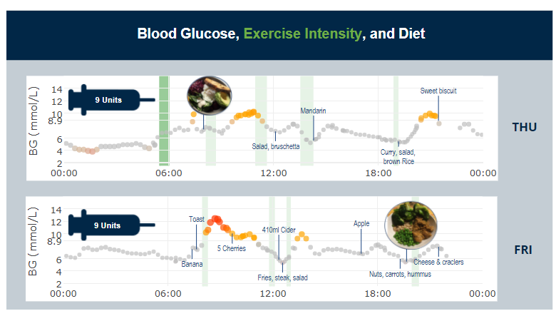
The data visualization below measures blood sugar, exercise intensity, and diet. Each dot represents a blood glucose (BG) measurement for a patient over the course of a day. Note that the blood sugar measurements are not collected at regular intervals so there are gaps between some of the dots. In addition, the y-axis label spacings are irregular because this chart needs to emphasize the critical point of a BG of 8.9. The dots also get larger the further they are from a BG of 6 and color is used to emphasize extreme values. Finally, green shading is used to indicate the intensity of the patient’s physical activity, and readings from a food diary have been automatically added to this chart.
While this R visualization is awesome, it can be made even more interesting by overlaying visual elements such as images and headings.
You can look at this R visualization live, and you can hover your mouse over points to see the dates and times of individual readings.
The bad: It is very painful to create visual confections in R
In his book, Visual Explanations, Edward Tufte coins the term visual confections to describe visualizations that are created by overlaying multiple visual elements (e.g., combining charts with images or joining multiple visualizations into one). The document below is an example of a visual confection.
The chart created in R above has been incorporated into the visualization below, along with another chart, images, background colors, headings and more – this is a visual confection.
In addition to all information contained in the original chart, the patient’s insulin dose for each day is shown in a syringe and images of meals have also been added. The background has been colored, and headings and sub-headings included. While all of this can be done in R, it cannot be done easily.
Even if you know all the relevant functions to programmatically insert images, resize them, deal with transparency, and control their order, you still have to go through a painful trial and error process of guesstimating the coordinates where things need to appear. That is, R is not WYSIWYG, and you really feel this when creating visual confections. Whenever I have done such things, I end up having to print the images, use a ruler, and create a simple model to estimate the coordinates!
The solution: How to assemble many visual layers into one data visualization
The standard way that most people create visual confections is using PowerPoint. However, PowerPoint and R are not great friends, as resizing R charts in PowerPoint causes problems, and PowerPoint cannot support any of the cool hover effects or interactivity in HTMLwidgets like plotly.
My solution was to build Displayr, which is a bit like a PowerPoint for the modern age, except that charts can be created in the app using R. The app is also online and can have its data updated automatically.
Click here to create your own layered visualization (just sign into Displayr first). Here you can access and edit the document that I used to create the visual confection example used in this post. This document contains all the raw data and the R code (as a function) used to automatically create the charts in this post. You can see the published layered visualization as a web page here.
Disclaimer
The views, opinions, data, and methodologies expressed above are those of the contributor(s) and do not necessarily reflect or represent the official policies, positions, or beliefs of Greenbook.
Comments
Comments are moderated to ensure respect towards the author and to prevent spam or self-promotion. Your comment may be edited, rejected, or approved based on these criteria. By commenting, you accept these terms and take responsibility for your contributions.
More from Tim Bock
Research Methodologies
Rotate Your Correspondence Analysis to Better Understand Your Brand Positioning
Tim Bock on utilizing correspondence analysis.
Tim Bock
Research Methodologies
Data Visualization for Conjoint Analysis
Visualizations can summarize patterns that are commonly hidden in a simulator
Tim Bock
What’s Better Than Two Pie Charts?
Bad visuals stress the need for charts to be interpretable in seconds
Tim Bock
Insights Industry News
Using “Small Multiples” Visualizations for Big Success
Visualizing data can be made easier by utilizing small charts for comparison and analysis
Tim Bock
ARTICLES
Top in Quantitative Research
Research Methodologies
Moving Away from a Narcissistic Market Research Model
Why are we still measuring brand loyalty? It isn’t something that naturally comes up with consumers, who rarely think about brand first, if at all. Ma...
Devora Rogers
Chief Strategy Officer at Alter Agents
Qualitative Research
The Stepping Stones of Innovation: Navigating Failure and Empathy with Carol Fitzgerald
Natalie Pusch
Senior Content Producer at Greenbook
Sign Up for
Updates
Get content that matters, written by top insights industry experts, delivered right to your inbox.
67k+ subscribers