
Manage your listing
Follow a step-by-step guide with online chat support to create or manage your listing.
Community


Let’s talk

Dana Stanley
Greenbook’s Chief Revenue Officer
Categories
Research Methodologies
February 21, 2017
The 5 Second Rule and the Need to Create Instantly Recognizable Visualizations
To create visualizations that engage, we must create images that are instinctively recognized as images capable of portraying meaning.
by Tim Bock
0

By Tim Bock
Most people are busy. Many are bored. Designers take the view that they have a small amount of time, perhaps 5 seconds, to engage the viewer. They believe that if they fail, the viewer will just move on, and the communication will fail.
This begs an important question: how can we create visualizations that engage? Visualizations that are instantly recognizable? The obvious technique is to use chartjunk or create something beautiful. However, there is a simpler solution: create images that are instinctively recognized as images capable of portraying meaning (rather than noise).
The original visualizations: art
Let us start with art. Fine arts scholars deride The Creation of Adam as being cartoonish. However, millions queue every year in the Sistine chapel to view it.
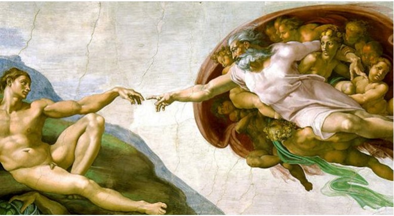
Contrast the painting above with the one below. The art cognoscenti love this one. But, many people when viewing it can be heard to mutter that it compares, unfavorably, with the work of children.
There is a simple explanation for why people view these works of art so differently. When we look at The Creation of Adam, we immediately recognize the images. And, if we are from a Judaeo-Christian background, there is a good chance that we understand the context and subtext of the picture. When we look at Mondrian’s work, on the other hand, the best sense that our brain can make of it is that it is an unusual brickwork or perhaps bathroom tiles. As we are not in the habit of searching for meaning in brickwork or bathroom tiles, our brains lack a useful frame of reference to guide interpretation of the painting. Most people just move on.
The difference between these paintings highlights the great challenge when designing visualizations. We need to design something that attracts the viewer’s attention. If all they see is a mess, they will often not take the time to decode the meaning, the meaning will not be recognizable. We have perhaps 5 seconds in which to attract the attention of the viewer, before they move on.

When heatmaps and treemaps go abstract
It is no accident I have shown you Piet Mondrian’s work. It is strikingly reminiscent of one of the more fashionable visualizations, the treemap with heatmap shading. It is from the Harvard Business Review. No doubt the people that use this visualization have been trained to use it. Rest assured, though, that most people will look at it, see nothing that attracts their brain, nothing instantly recognizable, and move on. (I will discuss this in another blog on coloring in heatmaps.)

The same idea, but with a great execution
Don’t get me wrong here. Treemaps and heatmaps can be great. The problem is just the execution of this one. Contrast it to the one below, which shows much more data.
Bill Gates loves this visualization, as it “shows that while the number of people dying from communicable diseases is still far too high, those numbers continue to come down”.

This visualization is great because it uses intensity, color, and proportionality in ways that they are used in nature, and so taps into our instincts, making the meaning recognizable. (I expand on this idea in my forthcoming blog posts on pie charts versus bar charts, and a another on using color in charts).

Visualization expert Stephen Few disagrees. He think that Causes of Untimely Death is a poor visualization. He has created an alternative visualization, which he suggests is vastly superior; it is is shown below. In some ways it is a better visualization: it is a lot easier to compare and contrast the numbers. Nevertheless, in a very important way, it is a much worse visualization. It is no longer recognizable as an image. It does not tap into our instinctive skills at finding patterns. It is hard to imagine many people engaging with this beyond 5 seconds.

I think it is a monster!
The next visualization verges on being art. It looks great. However, for all its beauty, it is only summarizing 12 numbers, which makes it a poor investment of time-to-create. Furthermore, it requires 8 text boxes to explain its interpretation, which is a bad sign. Why does it struggle to work as a visualization? It is thoroughly alien. There is little in our experience of humans to guide us in working out what it means. As we are not used to interpreting things like this, we find this very hard to interpret and the meaning is not instantly recognizable.

After a lot of thought I did end up realizing I had seen something similar before: the Sarlacc from The Return of the Jedi. Unfortunately, recognition of this passing similarity failed to help me interpret the visualization above.

Visualization guru Edward Tufte suggests that Charles Joseph Miniard’s 1861 Sankey diagram of the march of Napoleon may well be the greatest statistical graph ever created. It is a great visualization. However, if fails the 5 second rule. What can you see when you look at it? Perhaps it is a branch? But what does a branch have to do with Napoleon? I do discuss this in another post, but despite my love for it, ultimately it is only a visualization for the cognoscenti, who are few and far between in the normal audience for a viz.

Observe that with each of the examples, the issue is not complexity. The issue is familiarity. When we create visualizations, that tap into images that we are used to reading, it makes a big difference in making the meaning instantly recognizable.
This next visualization is showing a tweet network created using Nodexl. It has been clustered to show groups of people. Labels have been added to explain the clusters. The outcome for me is that my brain just gets confused. I see a Ferris wheel on the left, and streamers coming out from it. Again, while I can make some sense of it, it does not help me see a pattern.
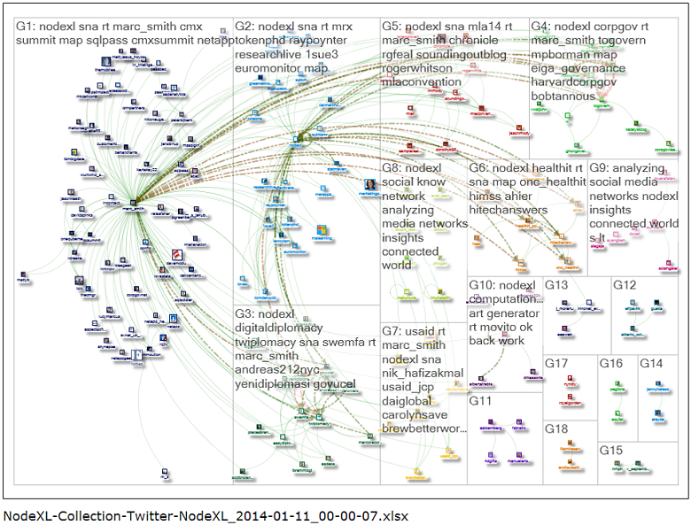
As is often the case, the visualization can be greatly improved by taking things away. Here is the same visualization, but with the commentary, color coding, and icons, removed. It is instantly more interpretable. Why? I see it as dandelions. I can see that there is one big dandelion on the left, which tells me that one person sent out a whole lot of tweets. There is only one more dandelion visible, and a much smaller one at that. No tweet storm occurred. Just a couple of people told a lot of other people.

To summarize the thesis of this post, I am trying to make two related points:
- We have about 5 seconds to persuade a viewer that a visualization is worth their focus.
- One way of engaging the viewer is to create images that use graphical elements in a way that is in some way familiar, where consistency with nature is a ready test of this.
I will finish off with perhaps my favorite interactive visualization, the OECD’s Create Your Better Life Index. A snapshot is below, but do check it out here. Why does it work so well? It works well because it taps into our ability to instinctively understand the height and shape of leaves on a tree.

Disclaimer
The views, opinions, data, and methodologies expressed above are those of the contributor(s) and do not necessarily reflect or represent the official policies, positions, or beliefs of Greenbook.
Comments
Comments are moderated to ensure respect towards the author and to prevent spam or self-promotion. Your comment may be edited, rejected, or approved based on these criteria. By commenting, you accept these terms and take responsibility for your contributions.
More from Tim Bock
Research Methodologies
Rotate Your Correspondence Analysis to Better Understand Your Brand Positioning
Tim Bock on utilizing correspondence analysis.
Tim Bock
Research Methodologies
Data Visualization for Conjoint Analysis
Visualizations can summarize patterns that are commonly hidden in a simulator
Tim Bock
What’s Better Than Two Pie Charts?
Bad visuals stress the need for charts to be interpretable in seconds
Tim Bock
Insights Industry News
Using “Small Multiples” Visualizations for Big Success
Visualizing data can be made easier by utilizing small charts for comparison and analysis
Tim Bock
ARTICLES
Top in Quantitative Research
Research Methodologies
Moving Away from a Narcissistic Market Research Model
Why are we still measuring brand loyalty? It isn’t something that naturally comes up with consumers, who rarely think about brand first, if at all. Ma...
Devora Rogers
Chief Strategy Officer at Alter Agents
Qualitative Research
The Stepping Stones of Innovation: Navigating Failure and Empathy with Carol Fitzgerald
Natalie Pusch
Senior Content Producer at Greenbook
Sign Up for
Updates
Get content that matters, written by top insights industry experts, delivered right to your inbox.
67k+ subscribers